

Key Takeaways
- Light gray remains the most popular headshot background choice in 2026, flattering nearly every skin tone and working across LinkedIn, company websites, and proposal decks.
- Consistent backgrounds across the team improve brand perception and trust. Companies with consistent branding see 23–33% higher revenue.
- Environmental backgrounds such as offices, labs, or urban settings work well when kept clean and softly blurred behind the subject.
- Coordinating brand colors subtly in the backdrop strengthens visual identity without overpowering the image.
- A documented “headshot spec” with approved background options, lighting notes, and wardrobe guidance prevents the patchwork look that plagues growing teams.
Introduction: Why Team Headshot Backgrounds Matter More Than Ever
Every team headshot tells a story before anyone reads a single word of your bio. In 2026, those images appear in more places than ever: LinkedIn profiles, website “Meet the Team” pages, pitch decks, conference programs, compliance submissions, and investor materials. The background behind each person shapes how viewers perceive trustworthiness, competence, and approachability in a matter of milliseconds.
This isn’t a trivial design detail. Consistent color use increases brand recognition by up to 80%, and companies with consistent branding see 23–33% higher revenue. When your team page displays a patchwork of selfies, outdated portraits, and clashing environments, it quietly signals disorganization. When it presents a unified, intentional look, it reinforces the professionalism your organization delivers.
This guide focuses on concrete, practical team headshot background ideas tailored for teams across industries including aerospace, tech, professional services, and manufacturing. Whether you are refreshing leadership portraits or standardizing images for a growing distributed workforce, you will find specific background options, trade-offs, and planning steps to get it right.
Best Team Headshot Backgrounds (Quick Guide)
If you are short on time, here are the best headshot backgrounds that work reliably for most teams:
- Light gray – universally flattering, works on light and dark mode UIs, and suits nearly every industry. The safest default.
- Charcoal or dark gray – adds gravitas for leadership and board portraits without the severity of pure black.
- Navy or muted blue – signals trust and competence, especially for finance, law, and conservative sectors.
- White or off white – clean and minimal, ideal for tech companies and healthcare organizations.
- Soft gradient (gray-to-charcoal or blue fade) – adds depth and a modern twist on classic studio looks.
- Simple office environmental – provides context while keeping faces center stage.
Neutral backgrounds are ideal for corporate headshots and team photos. The best background is the one that keeps faces front and center while aligning with your company’s brand. And consistency across the team matters more than any individual color choice.

Solid Color Backgrounds for Team Headshots
Solid backgrounds remain the most popular foundation for team headshots because they are easy to replicate, clean in execution, and scalable for organizations that add new hires regularly. When teams are distributed across multiple cities or working in hybrid arrangements, solid colors make it straightforward to achieve one unified look regardless of where each person is photographed.
Solid backgrounds are also ideal for digital headshot workflows where the same background is applied to every employee in post production. Whether you are a law firm, a SaaS company, or a manufacturing organization, a well-chosen solid color creates visual consistency that holds up across every platform.
Neutral Solids: Light Gray, Charcoal, and Black Backgrounds
Neutral solids are considered the best headshot backgrounds for classic corporate headshots, and for good reason. Light gray is the most popular background for professional headshots. It flatters most skin tones, looks professional on LinkedIn in both light and dark modes, and fits nearly any industry. Solid light grey backgrounds offer more depth while looking professional compared to flat white. Gray backgrounds communicate neutrality and sophistication, providing a sophisticated corporate feel without starkness.
Charcoal or dark gray works better for executive teams and board portraits. Charcoal gray backgrounds project authority and gravitas while remaining more accessible than pure black. Darker backgrounds in general project authority and gravitas, which makes them a natural fit for leadership pages.
A true black background delivers a dramatic, editorial look and conveys authority and creative edge. It works for keynote speakers, creative directors, and luxury brands. However, dark backgrounds require careful lighting. Without a rim or hair light, dark hair can vanish into the backdrop. For most corporate teams, charcoal is the safer call over pure black.
For wardrobe, suggest mid-tone jackets and shirts that create enough contrast against the chosen background so faces stay center stage.
White and Off-White Backgrounds
White backgrounds create a modern, minimal headshot look that integrates easily into contemporary web designs. White backgrounds signal clarity and premium quality, and they offer versatility for blending team photos into marketing materials. Graphic designers appreciate them because subjects are simple to cut out and drop onto brochures, slide decks, or ad creative. Solid white backgrounds provide the best separation from the subject when lit properly.
White backgrounds are ideal for healthcare provider headshots, and they are versatile for tech and healthcare headshots more broadly. Government ID-style photos and teams that need clean website visuals with text overlays also benefit.
The downsides are real, though. White can be harsh on very fair skin and may require careful lighting to avoid blown highlights or strong shadows. An off white or warm neutral softens that harshness and creates a more flattering effect across a range of complexions. If your team is diverse in skin tone, slightly warm off white is often the best background color for this category.
Muted Brand Colors and Mid-Tone Backgrounds
Using your company’s brand colors as muted solids creates a strong link between team headshots and overall identity. Pull from your official palette, but use softened, mid-tone versions instead of saturated primaries. Navy blue backgrounds convey trust and competence in headshots, and blue backgrounds trigger trust in 74% of viewers. Navy or muted tones work well in conservative industries like finance and law. Neutral tones like beige and navy provide a softer yet professional aesthetic, while warm tones like beige read as approachable and grounded.
For creative professionals, branded color blocks create cohesive team imagery. A muted teal or slate blue works for innovative tech brands; soft sage or warm taupe suits wellness professionals, sustainability-focused companies, or people-first brands.
The background should never match the exact color of jackets or dresses. Aim for complementary contrast instead. For large teams, one or two approved brand-aligned background colors used systematically prevent visual chaos.
Traditional and Specialty Studio Headshot Backgrounds
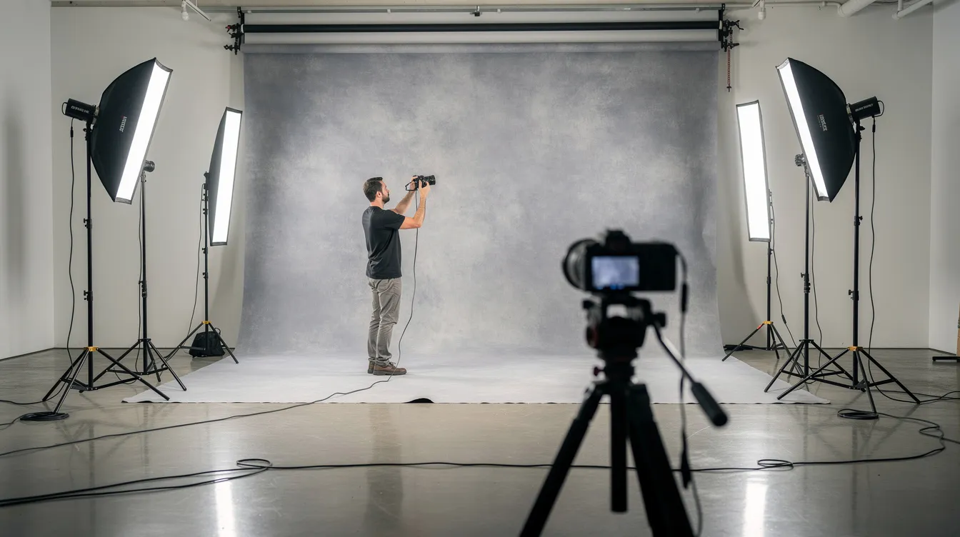
Beyond flat solid colors, studios offer gradients, textured surfaces, and printed scenes that still look fresh in 2026. These headshot backgrounds work best when teams want a more premium or artistic feel without sacrificing professionalism. The key requirement is uniformity and repeatability, especially if you onboard new team members regularly and need them to match existing portraits.
Soft Gradient Backgrounds
Gradient backgrounds blend colors for sophistication in photos, adding visual interest compared to flat solids. A light gray fading to charcoal, or a steel blue transitioning to navy, draws the eye naturally toward the subject by lightening behind the face and darkening toward the edges.
Gradients work especially well for corporate headshots where teams want a modern twist on classic studio looks. Gray gradients suit conservative industries, blue gradients fit financial services and tech companies, and warm neutral gradients complement client-facing roles where approachability matters. Because gradients are easy to standardize, they hold up well for recurring headshot sessions across multiple years.
Textured and Subtle Abstract Backgrounds
In headshot photography, “textured” refers to painted canvas, brushed concrete, or faint abstract patterns that add depth without heavy or busy details. Hand-painted canvas adds depth and sophistication to professional branding, and hand-painted canvas backdrops are favored for their artistic look. Textured muslin backgrounds give an artistic, high-end feel to headshots, while textured architecture backgrounds add depth without distraction.
These backgrounds suit architecture firms, design consultancies, and high-end professional services. Keep patterns extremely subtle so they don’t compete with the subject’s face or introduce moiré on digital platforms. Stick with desaturated tones like smoked blue, stone gray, or soft olive that align with the company’s visual identity.
Specialty Printed Studio Backgrounds
Specialty backdrops simulate real spaces like a modern office, a city skyline, or a factory floor while keeping the scene deliberately out of focus. Modern backgrounds add contextual relevance about the workplace without requiring you to actually shoot in a production facility or operations center.
These work well for organizations that want a specific environment in the picture but need strict control over lighting and weather. Printed scenes must be high quality and slightly abstracted; realistic but sharp prints can look artificial or dated. Commit to one or two specialty designs so future hires photograph beautifully against the same scene, preserving consistency.
Environmental Headshot Backgrounds for Teams
An environmental background places people in real-world locations like offices, shop floors, city streets, or outdoor campuses, kept softly blurred behind the subject. Environmental backgrounds add context to professional headshots, and they are increasingly popular in 2026 for showing authenticity. They work especially well for brand storytelling on “About Us” pages and recruitment materials.
The tradeoff is clear: more authenticity and personality versus slightly less visual uniformity compared with studio solids.
Office and Workplace Backgrounds
Real offices make strong environmental backgrounds when properly managed. Glass walls, conference rooms, hallways, and collaboration spaces all work. Modern office interiors provide context while keeping focus on the subject, and modern office spaces feature clean architectural lines and blur backgrounds effectively. Natural light office environments create a warm and professional tone.
Creative industries often prefer blurred office settings to highlight culture. Use a wide aperture and shallow depth of field so desks, screens, and decor are recognizable but soft. Blurred office backgrounds add depth without distracting from the subject. Before each shoot, do a quick “frame sweep” to remove cables, random paperwork, old posters, and brand-confusing logos. Plan lighting carefully with consistent color temperature so the background doesn’t shift green or orange compared to skin tones.
Industrial, Manufacturing, and Lab Backgrounds
Teams in operations-heavy industries like aerospace manufacturing, MRO, and engineering increasingly want real workspaces behind their people. Safely accessible areas of the factory floor, assembly lines, or inspection bays make powerful backgrounds with strict attention to safety and cleanliness.
Use a blurred background so equipment and tooling read as shapes and context, not as distractions or proprietary details. Coordinate PPE and uniforms with background colors for a cohesive, intentional look. Capture both leadership and frontline staff in similar industrial settings to reinforce a unified operations story across your company websites and materials.
City, Campus, and Urban Backgrounds
A city skyline, modern building facade, or corporate campus can act as a dynamic environmental background for headshots. Shoot with the subject several meters away from buildings or railings so the photographer can create a pleasing bokeh of urban shapes and lights. These backgrounds work well for consulting, real estate agents, finance teams, and startups wanting a fast-paced, modern vibe. Vibrant startup workspaces use colorful elements to appear approachable.
Avoid landmark-heavy or touristy spots that distract. Focus on clean lines, glass, and modern architecture. Consistency comes from shooting multiple team members in the same few spots at similar times of day for matching light.
Outdoor Natural Backgrounds
Parks, courtyards, and landscaped campuses create soft outdoor background options for approachable, people-centric brands. Use wide apertures and enough distance so trees, paths, and foliage blur into simple shapes and color blocks in natural settings.
This outdoor background style suits education, nonprofits, wellness professionals, life coaches, and companies emphasizing sustainability. Shoot in open shade or during golden hour to avoid harsh midday sun, squinting, and deep shadows. Wardrobe should contrast gently with greens and browns: navy, cream, and soft burgundy often photograph beautifully outdoors. Popular styles for headshot backgrounds vary between traditional and modern settings, and outdoor shoots represent one of the freshest modern options.

Digital and Virtual Headshot Backgrounds for Distributed Teams
Digital headshot backgrounds involve photographing people against a neutral backdrop and then replacing it in post production. Digital backgrounds ensure uniformity across team headshots, which is why they became mainstream during the remote work era and remain essential for distributed teams in 2026. A unified digital background ensures all employees appear in the same location, regardless of where they were actually photographed.
Digital backgrounds can be solid colors, gradients, simple offices, or branded designs. Environmental post-production allows digitally inserting backgrounds into photos, and AI-generated backgrounds can provide high-end backdrops for photos at scale. The critical requirement is high-quality cutouts, realistic lighting direction, and subtle shadows so the final image doesn’t look fake.
Choosing Digital Backgrounds That Actually Look Real
Match digital backgrounds with realistic perspective, horizon lines, and focal length. Simple designs work best: softly blurred office interiors, neutral gradients, and brand-color solids instead of busy or gimmicky scenes. Align light direction and color temperature between subject and background so shadows fall consistently.
Create a small, curated set of one to three approved digital background files for all employees. Digital backgrounds allow for consistent headshot appearances across teams, and they are ideal when reshooting hundreds of people isn’t feasible but a new visual standard is needed. Avoid the temptation of a green screen for final images; while useful during capture, the final result depends entirely on retouching skill.
Custom Branded Backgrounds for Enterprise Teams
Enterprises can develop custom branded backgrounds incorporating brand colors, subtle gradients, and minimal graphic elements. Avoid heavy logos behind the head. Instead, use soft patterns, angled shapes, or color blocking aligned with brand guidelines.
Consistent neutral backgrounds help maintain a cohesive visual identity for remote teams, and digital backdrops help maintain unity for remote teams in photos. Involve marketing or brand managers in color and style decisions before rolling out a new standard. Custom branded backgrounds work especially well during rebrands or product launches where fresh visuals are needed for all staff.
How to Choose the Best Team Headshot Background
Choosing the right headshot background for a whole team requires planning beyond individual preference. Consider how images will look on company websites, internal directories, proposal decks, LinkedIn profiles, and press releases. The goal is visual consistency with enough flexibility to feel human and authentic.
Industry, Role, and Audience Expectations
Conservative industries like finance, law, and government favor neutral solids. White or gray backgrounds convey trust in corporate and legal photography. Classic backgrounds are ideal for large teams and corporate websites. For real estate professionals, city or architectural backgrounds signal market knowledge, while tech companies often lean toward clean white or muted brand tones.
Client-facing roles may need warmer, more approachable backgrounds than internal technical roles. Think from the audience’s perspective: what chosen background would signal “competent and trustworthy” at first glance? For aerospace and manufacturing organizations, gray or environmental lab shots reinforce precision and capability.
Team Size, Growth Plans, and Practical Constraints
Small teams can experiment more with environmental backgrounds, while large enterprises benefit from tightly controlled, repeatable setups. High-growth companies should choose different backgrounds they can easily replicate for dozens of new hires each year. Document a simple “headshot spec” with background selection, lighting diagram, and sample images for future professional photographer sessions. Use digital backgrounds or portable studio kits when teams operate across multiple offices.
Incorporating Brand Colors Without Overdoing It
Use brand colors as accents or gentle washes instead of loud, saturated fills that compete with faces. A soft teal gradient echoing a logo color, or a warm neutral textured backdrop that fits the overall brand palette, creates subtle alignment. Gelled lighting adds a colored light behind the subject for dramatic effects in specialized campaigns, but keep it out of standard team headshots. Test multiple backgrounds on real team members before committing. Subtle brand alignment in headshot backgrounds significantly improves visual cohesion across all collateral.
Coordinating Wardrobe and Background
Wardrobe choices should be considered alongside background options to avoid blending or clashing. Avoid exact color matches with the backdrop. Aim for one to two levels lighter or darker than the background tone. Solid or lightly textured clothing works better than bold patterns that fight with environmental backgrounds.
Useful pairings include navy jacket on light gray, charcoal suit on warm taupe, and jewel tones on white or off white backdrops. Provide employees with a short wardrobe guide ahead of photo day, including sample professional photos that show good combinations.
Common Headshot Background Mistakes to Avoid
Many otherwise great headshots fail because of small background errors that are easy to prevent. These mistakes become especially noticeable when viewing a whole team grid on a company website.
Cluttered, Distracting, or Off-Brand Environments
Open doors, messy whiteboards, random signage, and coffee cups all pull focus from the subject. Choose simple, clean backgrounds with tidy lines and minimal background objects. Viewers subconsciously judge organization and attention to detail based on what they see behind the subject. Environmental backgrounds should feel intentional, not like a random corner photographed in a rush.
Inconsistent Backgrounds Across the Same Team
Mixing whites, grays, outdoor shots, and office scenes on one team page makes an organization look disjointed. Inconsistency becomes glaring as teams scale. Standardize on one primary background for corporate headshots with clear instructions for any future photographer. Re-shoot or digitally align obviously mismatched legacy headshots as part of a brand refresh. Combining different crops, orientations, and mismatched backgrounds amplifies the disorganized effect.
Overly Trendy or Gimmicky Backgrounds
Neon signs, busy mural walls, novelty props, and extreme color gels look fun on social media but clash with long-term corporate needs like annual reports and investor decks. Avoid busy patterns that date quickly. Keep team headshot backgrounds timeless enough to last three to five years. Reserve trendier styles for personal branding shoots or campaign-specific imagery, not core team portraits.
Harsh Lighting and Poor Color Harmony
Mixed lighting from windows and overhead fluorescents produces odd color shifts in backgrounds and skin tone alike. Harsh spotlights on backgrounds or strong shadows pull focus away from the person’s expression. Use soft, even lighting on both subject and backdrop, with subtle separation light to avoid blending dark hair into dark backgrounds. Test how the chosen background works across different skin tones and hair colors within the team. Modest post-processing can balance tones, but it is far better to get color and light right in camera.
Planning a Team Headshot Project: Practical Steps
A successful team headshot project requires coordination between marketing, HR, operations, and the photographer. Here is a step-by-step approach for 2026.
Define Objectives and Visual Standards
Start with a clear objective: updating all LinkedIn profiles, refreshing the leadership page, or standardizing images after a rebrand. Collect five to ten example headshots from other organizations as visual references of preferred backgrounds and styles. Choose a primary background type before anything else. Document crop style, orientation, and expression guidelines alongside your background choice.
Test Backgrounds With a Pilot Group
Run a small pilot shoot with three to five people from different departments to test how chosen backgrounds perform in real conditions. Review pilot images on the actual platforms where they will appear. Make adjustments based on feedback: tweaking light gray to slightly darker, softening colored backgrounds, or reducing visible office clutter. Small test investments prevent costly full-team reshoots later.
Rollout, Scheduling, and Ongoing Maintenance
Group sessions by department, schedule in-office headshot days, or coordinate remote sessions with digital backgrounds. Keep a central repository of approved backgrounds, lighting diagrams, and best example shots. Create a recurring schedule for capturing headshots of new hires so the visual library stays current. Assign ownership to marketing or HR for maintaining headshot consistency. Periodically audit the website and internal directories to ensure no outdated or off-standard backdrops creep back in.

FAQ: Team Headshot Backgrounds
What is the single safest background choice for a mixed-industry team?
Light gray is the most universally safe choice across roles, ages, and skin tones. It looks professional on LinkedIn, internal directories, and websites running both light and dark themes. It offers enough contrast for most jackets and hair colors without feeling heavy. When stakeholders cannot agree on a more stylized option, light gray is the default that everyone can live with, and it is why many large enterprises standardize on it for their professional image.
How often should a company update team headshot backgrounds?
Most organizations refresh core team headshots every three to five years or when major brand changes occur. Review background style during rebrands, website redesigns, or leadership changes. Update digital backgrounds if color palettes or design systems shift significantly. Re-evaluate environmental office background locations after major office moves or renovations. Incremental updates are better than waiting a decade and replacing everything at once.
Can we mix environmental and studio backgrounds on the same team page?
Mixing can work if handled carefully, but it often looks inconsistent when used randomly. A clear rule helps: studio solids for the main grid and environmental shots for feature stories or individual profile pages. Use similar color families to reduce visual clash. For most companies, one unified background style on the main “Our Team” page is the safest approach. Test a mockup with both styles before committing to a mixed layout.
What background works best for LinkedIn headshots specifically?
Simple, clean backgrounds like light gray, soft off white, or muted navy deliver maximum clarity at small sizes. LinkedIn’s circular crop punishes busy environments, so solid or gently textured backdrops perform better than complex scenes. A great headshot on LinkedIn often uses a soft gradient behind the head to add depth without distracting on mobile. Preview a few background options on actual LinkedIn profiles before deciding, especially for online dating crossover profiles where approachability matters equally.
Is it worth digitally changing older headshot backgrounds to match a new standard?
Digital background replacement is often the fastest way to standardize a large set of legacy images. This is especially useful when rebranding or consolidating teams after mergers. Success depends on original photo quality and lighting; well-lit, high-resolution professional photos blend best with new digital backgrounds. Prioritize leadership and client-facing roles first if budget is limited. Work with professional retouchers to maintain natural edges, hair detail, and believable lighting when changing backgrounds in service industries where credibility is paramount.